GUMSHU
Project role: Logo, Brand identity, Packaging, Website/print design
Project timeline: Three weeks
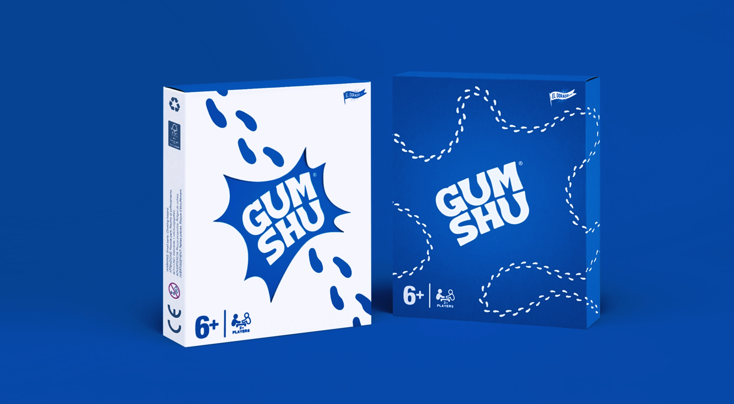
The challenge: Create a brand identity and 3D products for conceptual board-game with on-trend aesthetic packaging in 3 weeks.
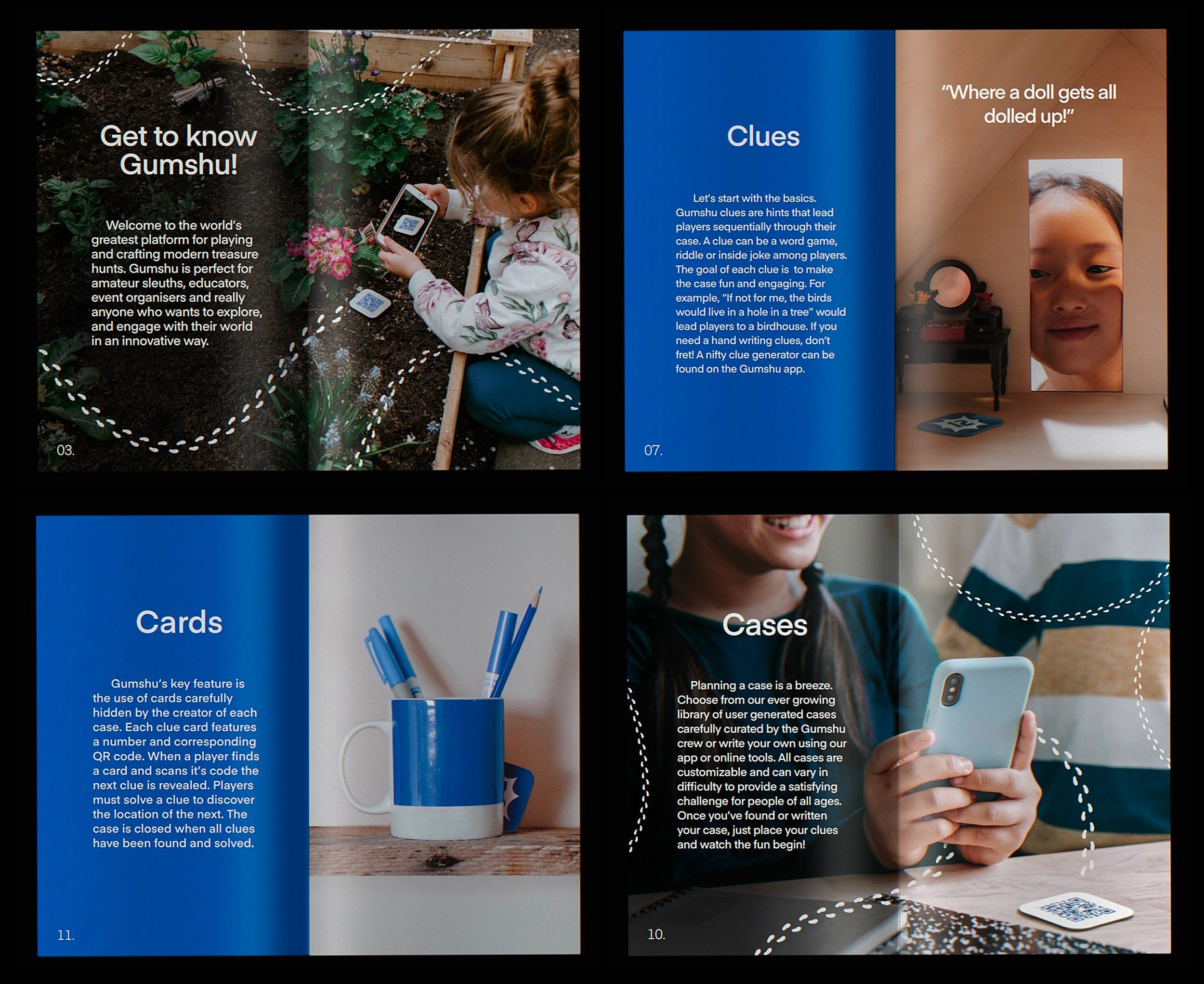
Gumshu (Pronounced Gumshoe) Is A modern scavenger hunt. A key feature of the game is the use of an app and physical cards to follow or generate challenging clues.
the word-mark
I developed the Gumshu word-mark to work across print, online and on the game’s 1.5” x 1.5” cards. The logo went through several iterations, at points being very illustrative and maximalist until I finally settled on a word-mark in which the negative space of each “u” was a footprint (a nod to the games key element). The foot prints appear Separate from the word-mark throughout the branding.
The brand
Thrillio is the custom font chosen for the primary typeface. it’s a bold and aesthetically pleasing typeface that emphasizes the kid-friendly nature of the game. Eina was chosen as the Secondary typeface for its clean feel and Legibility.
A constrained palette of relaxed blues and stark whites was chosen for it’s minimalism and easy recognition.
Software used
Adobe Photoshop
Affinity designer
Procreate
Image credits
pexels.com/@cottonbro/
pexels.com/@charles-parker/
pexels.com/@greta-hoffman/


