When it comes to plant-based meal delivery, there’s a monotonous swathe of earthy tones and lentils sitting in lettuce leaves. Not IKU though. They came to us in search of a deliciously different visual and verbal identity that would set them apart in the DTC space while still staying true to the roots they put down in their Sydney storefront almost 40 years ago.
Brand strategyVerbal identityVisual identityPhotographic art directionPackagingWebsite designWebsite buildBrand writing

nao partner decal
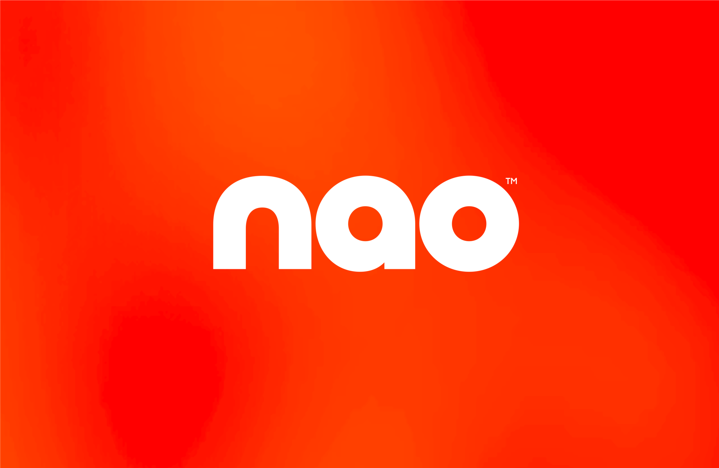
nao primary logo in ginger
The typography is confident and full of personality, which is mirrored in the verbal identity. Working with copywriter Cat Wall, we created a tone of voice and suite of messaging that reflects the honest and authentic nature of both the brand and its offering. Much like their food, it’s enticing, leaves you feeling good and there’s nothing fake or pretentious about it.

nao secondary logo in spring onion
the typography is confident and full of personality, which is mirrored in the verbal identity. Working with copywriter Cat Wall, we created a tone of voice and suite of messaging that reflects the honest and authentic nature of both the brand and its offering. Much like their food, it’s enticing, leaves you feeling good and there’s nothing fake or pretentious about it.

nao partner standee
The typography is confident and full of personality, which is mirrored in the verbal identity. Working with copywriter Cat Wall, we created a tone of voice and suite of messaging that reflects the honest and authentic nature of both the brand and its offering. Much like their food, it’s enticing, leaves you feeling good and there’s nothing fake or pretentious about it.

nao street ad

nao billboard ad

nao cuisine posters

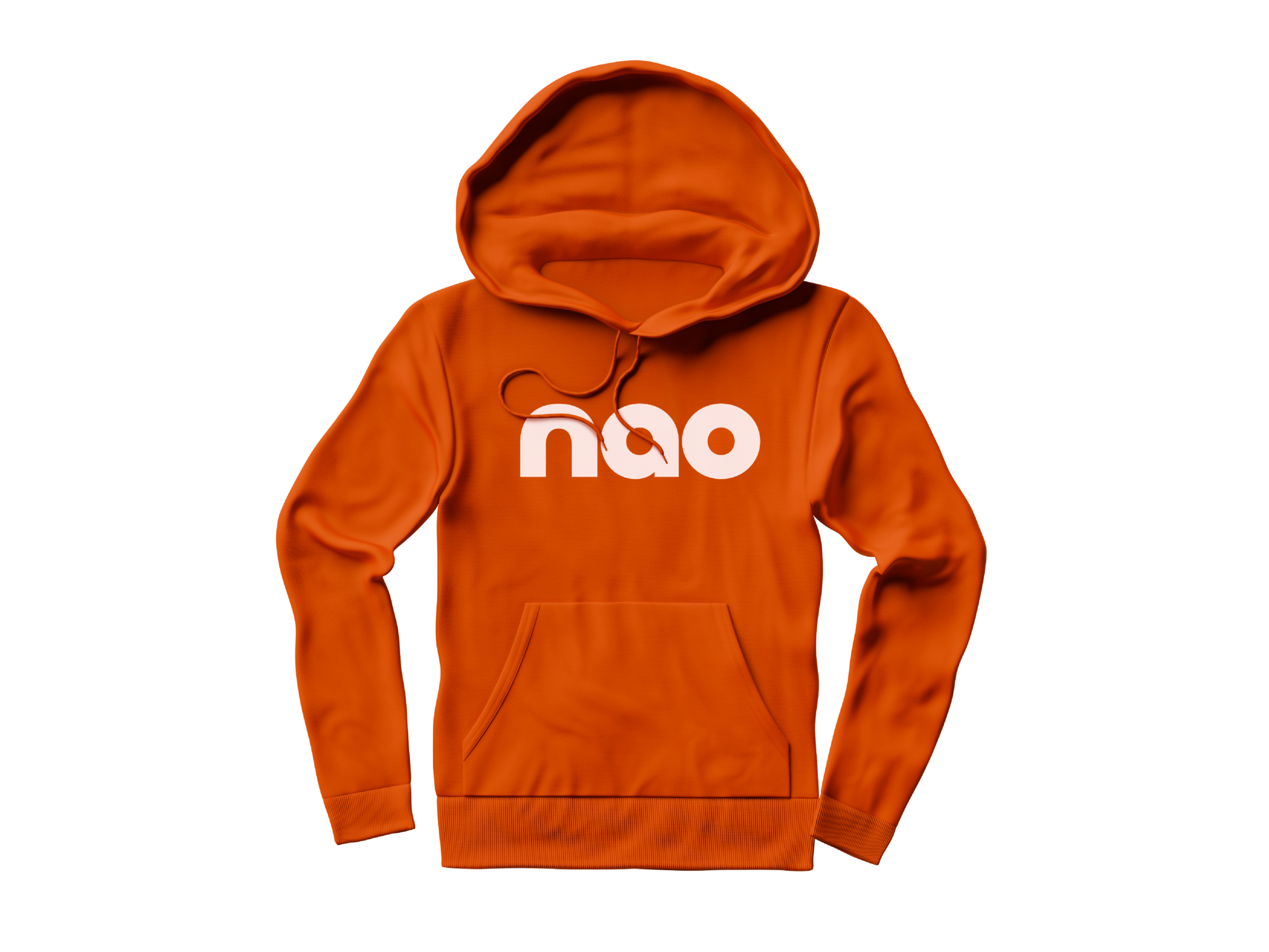
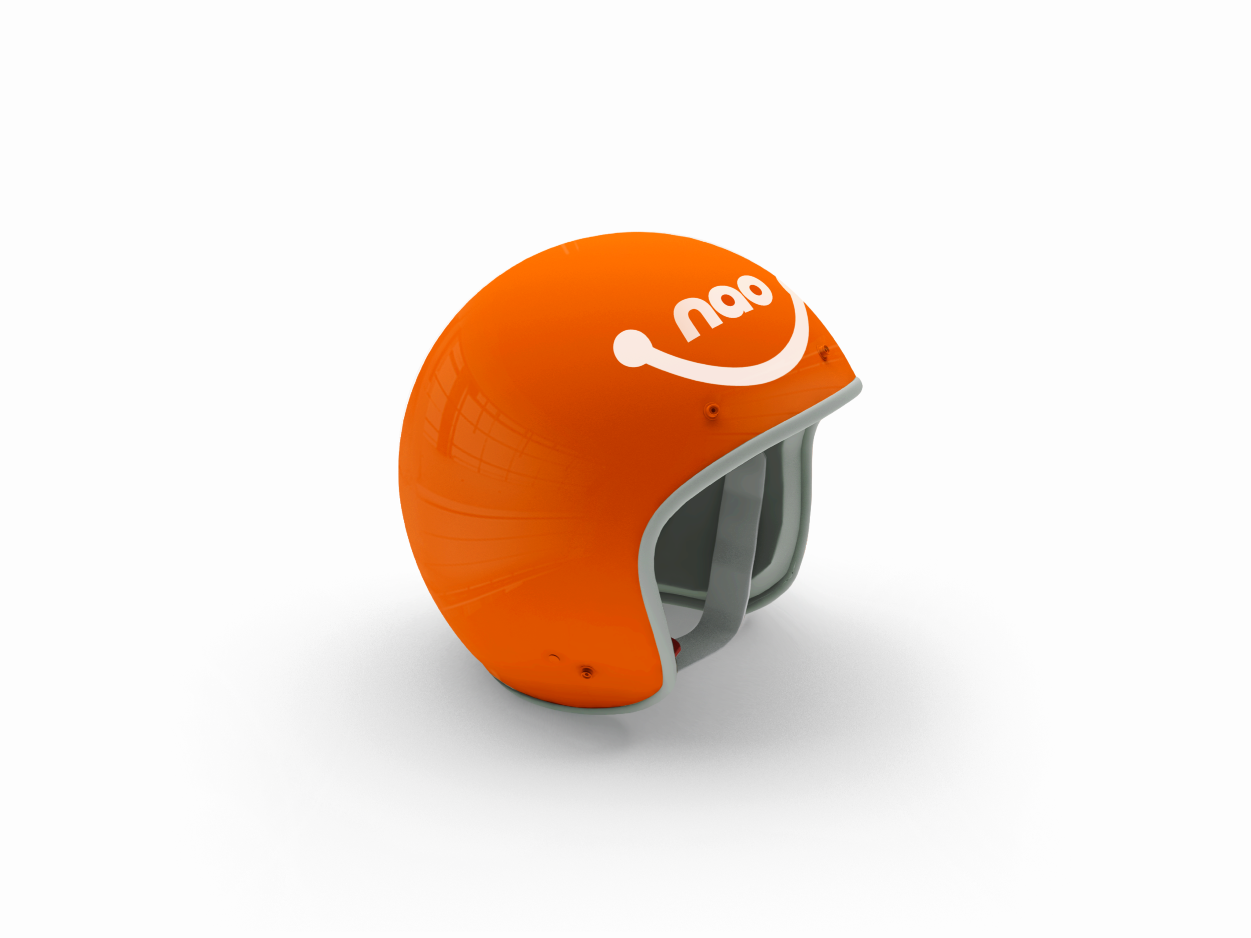
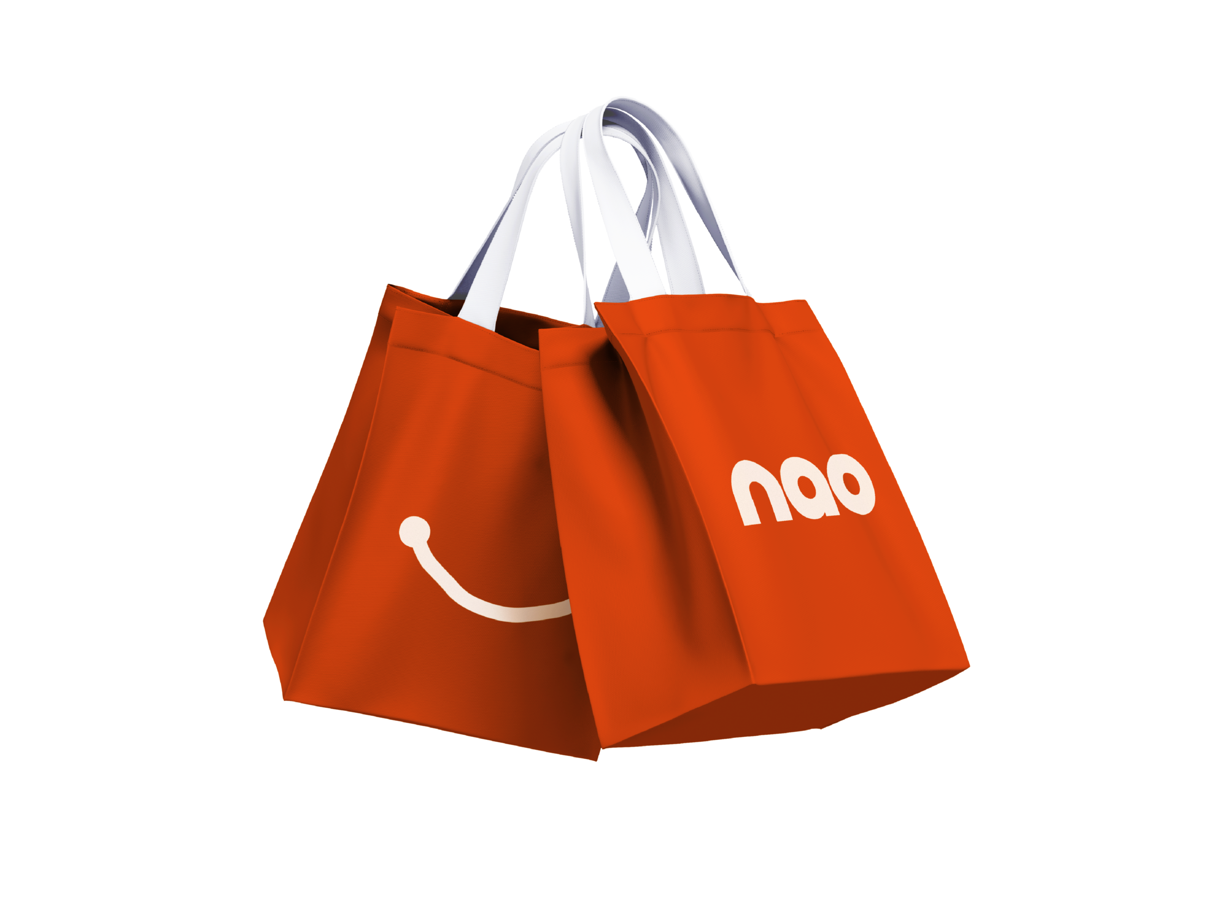
nao merch

nao car sticker

nao car sticker

nao web ad & app


nao partner standee
The typography is confident and full of personality, which is mirrored in the verbal identity. Working with copywriter Cat Wall, we created a tone of voice and suite of messaging that reflects the honest and authentic nature of both the brand and its offering. Much like their food, it’s enticing, leaves you feeling good and there’s nothing fake or pretentious about it.

The story
Contrary to popular belief, Lorem Ipsum is not simply random text. It has roots in a piece of classical Latin literature from 45 BC, making it over 2000 years old. Richard McClintock, a Latin professor at Hampden-Sydney College in Virginia, looked up one of the more obscure Latin words, consectetur, from a Lorem Ipsum passage, and going through the cites of the word in classical literature, discovered the undoubtable source. Lorem Ipsum comes from sections 1.10.32 and 1.10.33 of "de Finibus Bonorum et Malorum" (The Extremes of Good and Evil) by Cicero, written in 45 BC. This book is a treatise on the theory of ethics, very popular during the Renaissance. The first line of Lorem Ipsum, "Lorem ipsum dolor sit amet..", comes from a line in section 1.10.32.
The standard chunk of Lorem Ipsum used since the 1500s is reproduced below for those interested. Sections 1.10.32 and 1.10.33 from "de Finibus Bonorum et Malorum" by Cicero are also reproduced in their exact original form, accompanied by English versions from the 1914 translation by H. Rackham.
the cites of the word in classical literature, discovered the undoubtable source. Lorem Ipsum comes from sections 1.10.32 and 1.10.33 of "de Finibus Bonorum et Malorum" (The Extremes of Good and Evil) by Cicero, written in 45 BC. This book is a treatise on the theory of ethics, very popular during the Renaissance. The first line of Lorem Ipsum, "Lorem ipsum dolor sit amet..", comes from a line in section 1.10.32.
nao gift cards
The typography is confident and full of personality, which is mirrored in the verbal identity. Working with copywriter Cat Wall, we created a tone of voice and suite of messaging that reflects the honest and authentic.
nao cuisine posters